| Profile image replacement | Votes for deletion |
1 • 2 • 3 • 4 • 5 • 6 • 7 • 8 • 9 • 10 • 11 • 12 • 13 • 14 • 15 • 16
Changing the profile image (the image in the article's infobox, or the top image to the right of the introduction to a large majority of articles) is one of the most common proposed changes to articles on Green Lantern The Animated Series Wiki. Due to the regularity with which profile image changes are suggested, Green Lantern The Animated Series Wiki centralizes these changes on this page.
Procedures[]
- To make a proposal, click "Make your proposal".
- Put a reasonable explanation as to why you think the image is a better choice.
- Users may make a proposal by uploading the image(s) they wish to propose, and clicking the "Make your proposal" button above, then filling out the fields required.
- It is preferred that all images should be in a ratio of 355x200, or 400x300 if the image has been cropped.
- Images should also be of a .png filetype to avoid a grainy thumbnail.
- Preview it, review it, and publish it.
- Await your votes.
Rules and Standards[]
- The image should be an accurate, dignifying representation of the character.
- If an article contains three images or more (including the infobox), an image from the character's torso is sufficient for the infobox. [...] Extreme facial closeups should be avoided.
- An image must get three or more votes in order to be chosen.
- If after a week, no one replies to a proposal, then the image can be replaced without discussion or voting.
- Sign your signature by using "~~~~"
Current proposals[]
Ganthet[]
| This discussion is closed. The result of this discussion was: |
|---|
| Proposed will be the new image. |
| Please do not edit this discussion. |
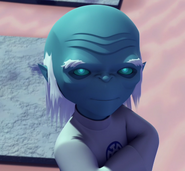
new duds, new image proposal. Personally I go for 1. Godblaster (talk) 22:42, January 14, 2013 (UTC)
- He's wandering off into space on the first one. :P The second one shows him at a bad facial expression for his character. Ganthet is always happy, well mostly happy. I'm down for 1 for 3. --REGULAR GUY (Message me) ٩(͡๏̯͡๏)۶ 23:00, January 14, 2013 (UTC)
Any final words? --REGULAR GUY (Message me) ٩(͡๏̯͡๏)۶ 20:51, January 16, 2013 (UTC)
I say do it.--Godblaster (talk) 21:04, January 16, 2013 (UTC)
Saint Walker[]
| This discussion is closed. The result of this discussion was: |
|---|
| Proposed will be the new image. |
| Please do not edit this discussion. |
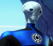
Just find 1 better. Scratch going for 2 now.Godblaster (talk) 23:03, January 14, 2013 (UTC)
- I cut off a tiny bit from #2, to get a better focus on Walker. I'm for #3. --REGULAR GUY (Message me) ٩(͡๏̯͡๏)۶ 02:31, January 15, 2013 (UTC)
3. I originally was going to say 2 but I prefer the revision to it. --The Stone That The Builder Refused.
Blue Hope[]
| This discussion is closed. The result of this discussion was: |
|---|
| Proposed will be the new image. |
| Please do not edit this discussion. |
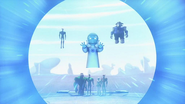
The current one, well to me, was just a placeholder. The old version doesn't really represent the episode very well in terms of the plot. The new one does. "Turning on the Central Battery attracts Manhunters". --REGULAR GUY (Message me) ٩(͡๏̯͡๏)۶ 02:27, January 15, 2013 (UTC)
- Lets go for 1.--Godblaster (talk) 08:42, January 15, 2013 (UTC)
Aya[]
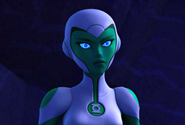
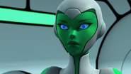
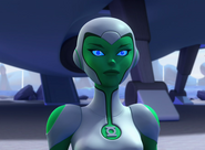
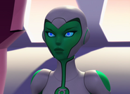
The current one is okay, but her mouth is open. Though, I'm not to fond of the proposal it is still a better image then the current. The expression on her face in the proposal is how her face is 99.99% of the time on screen. REGULAR GUY (Message me) ٩(͡๏̯͡๏)۶ 18:07, January 21, 2013 (UTC)
- Yeah, the new one looks better. Although if I may ask, can you crop the picture a bit more? I believe the image would benefit from being cropped to focus more on Aya, like the Saint Walker image. The Stone that the Builder Refused 19:11, January 21, 2013 (UTC)
- Cropping it more would ruin it for the portalskin on the main page. If you can find another image that meets the standards, then by all means upload it. --REGULAR GUY (Message me) ٩(͡๏̯͡๏)۶ 02:01, January 22, 2013 (UTC)
- Here are some more proposals. I'd go for 3 or 4--Godblaster (talk) 09:55, January 22, 2013 (UTC)
- Cropping it more would ruin it for the portalskin on the main page. If you can find another image that meets the standards, then by all means upload it. --REGULAR GUY (Message me) ٩(͡๏̯͡๏)۶ 02:01, January 22, 2013 (UTC)
3, Hands down. Although, the filename is 2. The Stone that the Builder Refused 04:11, January 22, 2013 (UTC)
- It needs to be optimized. --REGULAR GUY (Message me) ٩(͡๏̯͡๏)۶ 21:29, January 22, 2013 (UTC)
- 3's background is annoying me and she is leaning more to the right than in the center. I take back my earlier vote, #5/#1/#4 is best.
- Since Aya has taken a new form, should that form be the new picture for the infobox?--Godblaster (talk) 21:39, February 2, 2013 (UTC)
- Yeah. She's probably gonna be like that for some time. --REGULAR GUY (Message me) ٩(͡๏̯͡๏)۶ 21:41, February 2, 2013 (UTC)
- Since Aya has taken a new form, should that form be the new picture for the infobox?--Godblaster (talk) 21:39, February 2, 2013 (UTC)
- 3's background is annoying me and she is leaning more to the right than in the center. I take back my earlier vote, #5/#1/#4 is best.
Zartok[]
It's such an obvious choice. Let's get this over with. REGULAR GUY (Message me) ٩(͡๏̯͡๏)۶ 04:54, February 2, 2013 (UTC)
- Go for it, I say.--Godblaster (talk) 21:39, February 2, 2013 (UTC)
| This discussion is closed. The result of this discussion was: |
|---|
| Proposed will be the new image. |
| Please do not edit this discussion. |
Hal Jordan[]
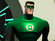
He looks too serious in the current and for some reason it's zoomed in on his face real tight. The proposal isn't perfect, and destine to be replaced, but I'd go for it for now. REGULAR GUY (Message me) ٩(͡๏̯͡๏)۶ 17:53, February 2, 2013 (UTC)
- Added prop. 2. --REGULAR GUY (Message me) ٩(͡๏̯͡๏)۶ 18:09, February 2, 2013 (UTC)
- I go for 1.--Godblaster (talk) 21:46, February 2, 2013 (UTC)
